Someone with low vision doesn’t see a blurry bathroom — they see a space where a white basin blends into a white wall, where the edge of the shower tray disappears, and where a silver tap on a silver worktop is invisible until they reach out and touch it. That’s where the danger starts.
A well-designed bathroom for low vision doesn’t need more square metres or a bigger budget than any other. It needs different decisions in three areas: contrast, light and texture. Three levers that, used well, give back independence to someone who currently needs assistance just to use the loo. Let’s go through them.
Why bathroom low vision design is about contrast, not size
Low vision isn’t blindness. It’s reduced sight that can’t be fully corrected with glasses: loss of acuity, of visual field, of contrast sensitivity. According to the World Health Organization, at least 2.2 billion people worldwide live with some form of visual impairment, near or far. This isn’t a rare edge case — it affects a huge number of people, many of them older.
The classic mistake is thinking that making things bigger will solve the problem. It won’t. What almost always fails is contrast. When everything is the same light tone, a low-vision eye can’t tell where one surface ends and another begins. The white toilet against a pale floor is the textbook example: the person genuinely can’t see where to sit.
Our rule is simple: every element the person needs to locate or touch must stand out from its background. The basin from the worktop. The toilet from the floor and the wall. If you squint and everything merges into one pale blur, you’ve got a problem.
Contrast: the lever that transforms a bathroom
Chromatic contrast is measurable. It isn’t about “looking nice together” — it’s about the difference in luminosity between two adjacent surfaces. The technical reference we work from is Spain’s Código Técnico de la Edificación (CTE), its Basic Document on Safety in Use and Accessibility (similar in scope to UK Building Regulations Part M), which requires sufficient contrast between elements to make them perceptible.
Where to apply it, in order of priority:
- Toilet against floor and wall. A coloured toilet or a dark wall behind it solves the “I can’t see where it is” problem. A contrasting-colour seat lid makes a huge difference.
- Basin against worktop. White basin on a dark worktop, or the reverse. Never white on white.
- Grab rails against the wall. A white rail on white tiles is invisible. In colour — red, navy, anthracite — it can be found instantly.
- Door frame and shower screen edge. The glass edge of a shower enclosure is treacherous. A coloured profile or a matte strip prevents collisions.
- Light switches and taps. Switch plates that contrast with the wall. Taps in black or matte chrome on a light worktop.
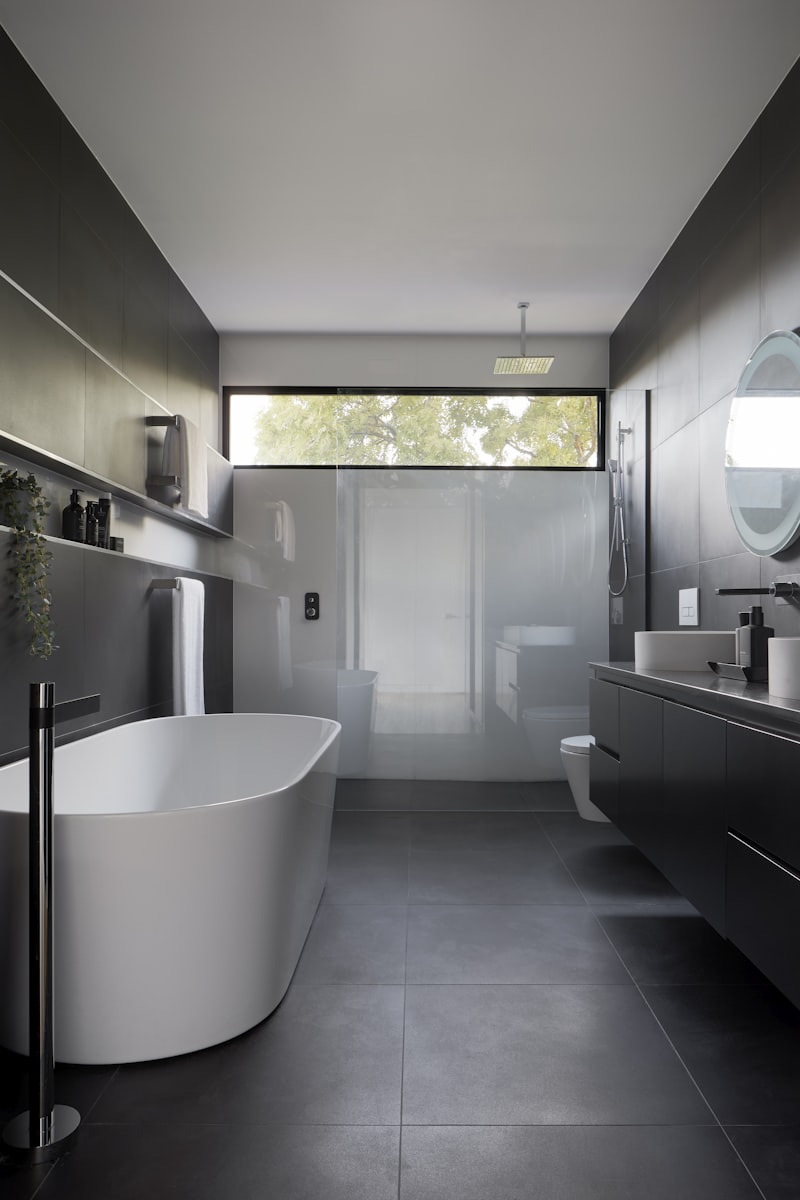
One opinion from us, for what it’s worth: many families worry the bathroom will end up looking “like a care home”. It doesn’t have to. An anthracite-grey toilet, a matte black grab rail and dark porcelain floor tiles look genuinely modern while solving the contrast problem completely. We cover this in detail in our guide on how to make an accessible bathroom that doesn’t look like a hospital.
Light: even, generous and glare-free
The second lever is lighting — and here the low-vision eye is demanding in contradictory ways: it needs plenty of light, yet it can’t cope with glare or harsh shadows.
Three rules we always apply:
- More than usual. A standard bathroom is lit to around 200–300 lux. For low vision we go to 500 lux or more, particularly at the mirror and washbasin area. More LEDs, better distributed.
- Even light, no dark patches. A single ceiling fitting leaves shadows in exactly the spots where someone needs to see clearly. We combine general ceiling lighting with lights on both sides of the mirror — not above it (overhead light on a face casts shadows under the eyes and distorts what you see).
- No glare. Bare spotlights aimed at eye level, large mirrors bouncing window light, highly polished floors reflecting everything back — all of these temporarily blind someone who already has limited sight. Stick to matte finishes and diffused fittings.
Colour temperature matters too. A neutral white (around 4,000 K) renders colours more accurately and helps perceived contrast; very warm light flattens it. If you want the full breakdown on IP ratings, lumens and common mistakes, our practical bathroom lighting guide covers the detail.
Texture: what the eye misses, the foot and hand tell you
When sight fails, touch compensates. That’s why flooring and surfaces in a low vision bathroom should “speak” to the person using them.
A change of texture underfoot signals a zone change without needing to see it: a different floor surface as you step into the shower, a non-slip strip you can feel underfoot marking the transition to the wet area. It’s the same logic as tactile paving on pavements, applied to the bathroom.
Non-slip flooring is non-negotiable. We’re talking Class 3 slip resistance (what the CTE requires for wet zones and shower trays). And to be clear: genuinely non-slip doesn’t mean rough and uncomfortable. We explain this in detail in our article on whether anti-slip shower trays are actually slippery.
The same principle applies to the hands. Lever taps that feel distinct to the touch, controls with raised detailing, grab rails with a surface that grips even when wet. Small details that add up to real confidence.
Quick reference: what to prioritise in a low vision bathroom
| Element | Problem with low vision | Solution |
|---|---|---|
| Toilet | Blends into pale floor/wall | Contrasting colour or coloured seat lid |
| Basin and worktop | Same tone, impossible to distinguish | Light/dark contrast between the two |
| Grab rails | White on white tiling | Coloured rails, matte finish |
| Lighting | Shadows and glare | 500 lux, even distribution, matte, no bare spotlights |
| Floor | Zone changes go unnoticed | Texture change + Class 3 non-slip |
| Taps | Flat, silver controls | Lever style with raised detailing, contrasting colour |
What’s worth changing in a renovation — and what isn’t
You don’t need to gut the entire bathroom to make a significant difference. Replacing the toilet with a contrasting-coloured one, redistributing the lighting and fitting coloured grab rails is a manageable job. If you’re already having work done, take the opportunity to sort out the non-slip flooring and a step-free shower at the same time.
One important point: these works often qualify for accessibility grants and the reduced VAT rate (IVA reducido, currently 10% in Spain instead of 21%). We see this regularly here in Valencia — particularly in flats in the Eixample and neighbourhoods like Patraix, where the older population is significant and the bathrooms are often original 1970s fittings. We go through all the safety measures in our guide to preventing bathroom falls, which is well worth reading if the person concerned lives alone.
Frequently asked questions
What’s the best colour for a bathroom for someone with low vision?
There’s no magic colour — there’s contrast. What matters is that each key element stands out from its background: dark against light, or light against dark. A dark floor with a light toilet works well; all white does not.
How many lux does a low vision bathroom need?
Aim for 500 lux or more at the mirror and washbasin, compared with the 200–300 lux of a standard bathroom. And distribute it properly: high levels with shadows is still a problem.
Do grab rails need to be a specific colour?
Any colour that contrasts with the wall. If the tiling is light, an anthracite, navy or red rail is immediately findable. A white rail on a white wall is exactly what you want to avoid.
Is a low vision bathroom also suitable for an older person with no sight problems?
Yes, very much so. Contrast, good lighting and non-slip flooring prevent falls for everyone. It’s the foundation of a proper accessible bathroom for older people.
Do these improvements qualify for grants or reduced VAT?
Accessibility renovations often qualify for the reduced VAT rate (10%) and for regional and local grants. It depends on your specific situation and the year. We check this with you before any work starts.
Start with what makes the biggest difference
If we had to pick one place to begin, it would be this: fix the contrast on the toilet and the lighting at the mirror. These are the two spots where someone with low vision struggles every single day, and the two quickest to put right.
Want to see what your bathroom could look like? Browse our bathroom designs, get an estimate with the cost calculator or see how we handle bathroom renovations in Valencia. And if you’d prefer us to come and take a look in person, just say the word — we plan every element around how the person who lives there actually moves and sees, not around a catalogue photo.